Chapter 3 Supply and Demand
The concepts of supply and demand are the primary conceptual framework in microeconomics. Supply and demand curves, which we’ll focus on in terms of graphs and curve shifts, describe how a market will function, the number of goods sold, and the price that “clears the market.” These concepts will underpin our later discussion of externalities and solutions to market failures.
3.1 Demand
The demand curve, quite simply, describes the quantity of goods that consumers are willing to buy at a certain price. When prices go up, people want to buy less while when prices go down, they want to buy more. This pattern and the shape of the demand curve comes directly from the utility theory framework discussed in the previous chapter.
3.1.1 Demand Comes From Consumers Maximizing Utility
Let’s suppose the price of pizza, per slice, decreases from $4 to $3 - how does this change consumption?
First, the budget line is shifted. Suppose our consumer had a budget of $100, her budget set would be as described in Figure 3.1.
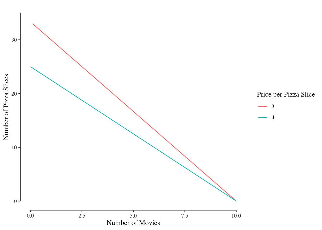
Figure 3.1: Budget Sets at Pizza Prices of $4 and $3
We know that the old optimal point happened on the budget line. With the price decrease, the new budget line is entirely to the right of the old budget line, indicating that the optimal bundle must change, 3.2.
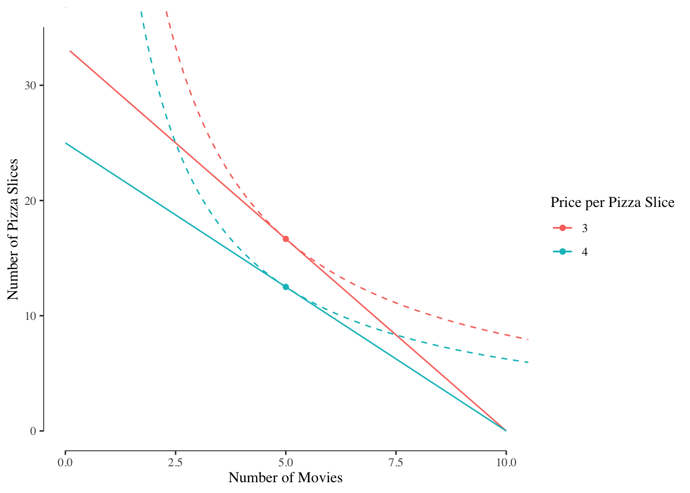
Figure 3.2: Budget Sets and Indifference Curves at Pizza Prices of $4 and $3
With the change in the price of pizza, the consumer shown here has increased her consumption of pizza from 12.5 slices to 16.67 slices.7
The same pattern happens in reverse - as prices increase, the number of slices consumed would go down.
Suppose we have three people in the market:
| Name | Budget | Preference for Pizza | Preference for Movies |
|---|---|---|---|
| Robert | 100 | 1.25 | 0.90 |
| Jane | 120 | 0.85 | 1.33 |
| Jeff | 80 | 1.13 | 0.75 |
We could then compute for each person the number of pizza slices that they would consume at a given price with their preferences and budget set. There is variability resulting from both the different budges and different preferences for pizza, Figure 3.3.
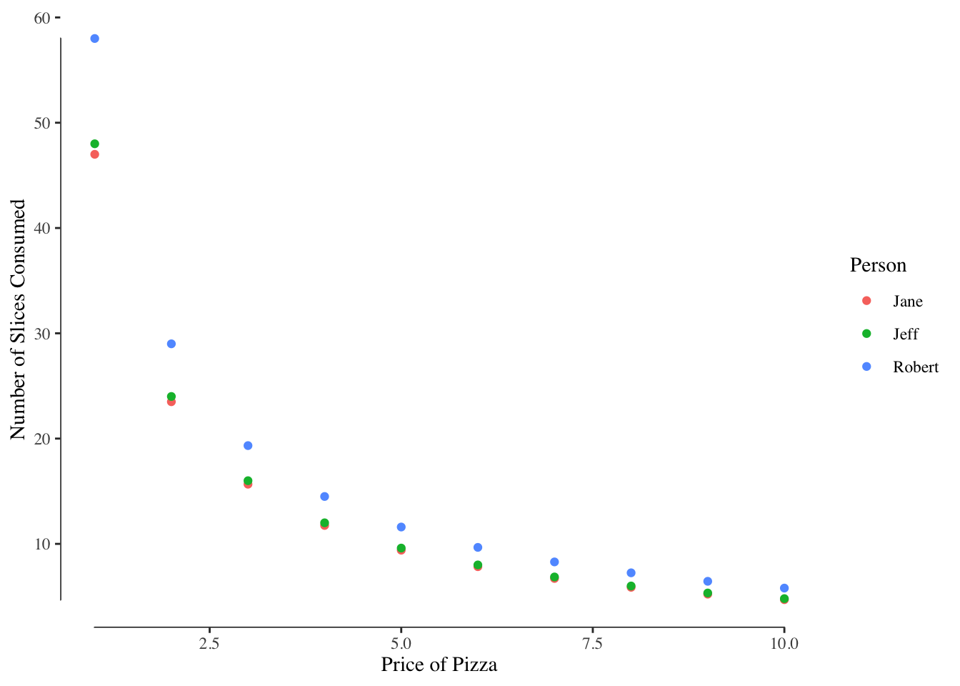
Figure 3.3: Consumption of Pizza at Different Prices of Pizza
Likewise, we could add up the pizza demanded by each of the three consumers and see the total quantity of pizza demanded by the whole market for each price, Figure 3.4. Note that the label of the x and y axes changed between Figure 3.3 and Figure 3.4 - this is often a source of confusion.8
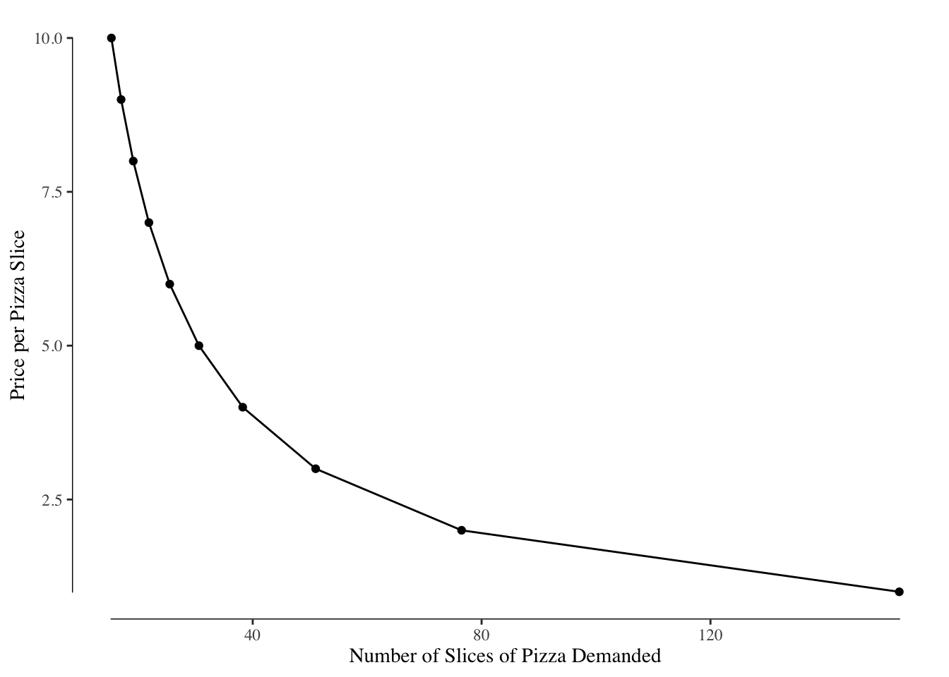
Figure 3.4: Consumption of Pizza at Different Prices of Pizza (Note the flipped axes)
3.1.2 Elasticity of Demand
The quantity demanded changes with the price of the good. The more expensive, the less people will want to consume while cheaper, the more they’ll want to consume. We measure this responsiveness, the extent to which the quantity demanded changes with price, using metric called the elasticity of demand.
The elasticity of demand depends on the base price. For example, consider how many slices of pizza you would buy for $0.10. Most likely, a fairly large number given the low price. Suppose the price were increase by $1 to $1.10. How does your consumption change with the price increase? Given that the slices went from being nearly free to being approximately the “wholesale” price of a slice (assuming a whole pizza is 8-10 dollars and has 8-10 slices), you probably radically reduced the number of slices you wanted to buy.
Now consider the number of slices you might be willing to buy if the price were $10 per slice. There are times when we’d pay $10 per slice of pizza at things like the State Fair or when we are extremely hungry, but the quantity demanded would be very small. Now suppose we increased the price by $1 to $11 per slice. The quantity demanded would go down but likely not by very much, especially compared to the change when moving from $0.10 to $1.10.
The fact that this response varies depending on the current price and quantity demanded means that our measure of elasticity of demand has to vary with the current price and quantity. One simple way to define the elasticity of demand is to use the mid-point formula which gives us the percentage change in the quantity demanded per percentage increase in price. Formally,
\[E_d = \frac{\%\Delta Q_d}{\%\Delta P}\]
where \(E_d\) is the elasticity of demand, \(\% \Delta Q_d\) is the change in the quantity demanded as a percentage, and \(\% \Delta P\) is the change in price.
To compute this, we determine the price \(P_1\) at which \(Q_1\) units are demanded and the price \(P_2\) at which \(Q_2\) units are demanded. We then compute:
\[\% \Delta Q_d = \frac{Q_2 - Q_1}{\frac{Q_2 + Q_1}{2}}\]
and
\[\% \Delta P = \frac{P_2 - P_1}{\frac{P_2 + P_1}{2}}\]
We take the ratio of these two values, as in the equation for \(E_d\) to find the elasticity of demand for a price change from \(P_1\) to \(P_2\).
To make this a little more concrete, suppose if a good was $10 a piece and at that price consumers demanded 100 units but if the price increased to $11 the quantity demanded decreased to 85 units. We would have
\[\% \Delta Q_d = \frac{85 - 100}{\frac{85 + 100}{2}} = -15 / 92.5 = -0.16\]
Likewise, for price,
\[\% \Delta P = \frac{11 - 10}{\frac{11 + 10}{2}} = 1 / 10.5 = 0.095\]
And then:
\[E_d = \frac{-0.16}{0.095} = -1.68\]
Based on this calculation, when the price is $10 each 1% increase in the price is associated with a 1.68% decrease in the quantity demanded.
For nearly all goods the \(E_d < 0\) meaning that when the price of the good increases, the quantity of the good decreases.9 We generally group goods as being either elastic or inelastic.
Elastic goods are goods where increases in price lead to significant decreases in the quantity demanded. For instance, ribeye steak, which tends to be more expensive than sirloin steak, is a relatively elastic good. If the cost of beef, or ribeye steak in particular, increases by a large amount, we would expect the total quantity of beef, and ribeye steaks in particular, to go down. The high level of responsiveness to price in the quantity demanded makes ribeye steaks an elastic good. For a good that is perfectly elastic, the demand curve is horizontal. Any change in price is associated with an infinite change in the quantity demanded. While no good is perfectly elastic, in general elastic goods will have flatter demand curves reflecting a greater sensitivity to price.
Inelastic goods are goods where the quantity demanded does not meaningfully vary with the price of the good. A classic example would be life-saving medications, like insulin for people with Type I diabetes. Without these medications, people who need insulin would become very ill and may die. These drugs are literally critical for their survival. The only people buying these medications are people who need them. As a result, when there is a price increase, the quantity demanded essentially remains unchanged. Likewise, if there is a price decrease, few people increase their consumption. The amount of insulin demanded is determined by the number of people with Type I diabetes or Type II diabetes that require insulin, not the price. The good is said to be inelastic as consumption does not change with price. The ideal inelastic good will have a demand curve that is a vertical line as changes in price have zero impact on the quantity demanded. Some inelastic goods are close to this perfectly inelastic good example and all inelastic goods will have demand curves that are steeper.
We also make a distraction between short run and long run elasticity. A good may be very inelastic in the short run but elastic in the long run.
Gas, as an example, is relatively inelastic in the short run. Whether the price of gas is $2.30 a gallon or $2.75 a gallon likely does not determine whether you drive on an errand or make a summer road trip. Even if gas got really cheap, say $1.00 a gallon, or very expensive, say $3.50 a gallon, your driving would likely not change much. But over the longer term, higher or lower gas prices would almost certainly influence your choice of car, increasing or decreasing the importance of fuel economy.
In the late 1990s, fuel prices were very low and so the size of cars increased, this was the first big “boom” period of SUVs. In the mid-to-late 2000s, fuel prices increased and people started buying smaller cars and demand for hybrid cars increased. However, starting around 2014 and lasting until today, the price of fuel decreased and the size of cars increased with many auto makers discontinuing sedans in favor of larger SUVs and pickups.10
As a result, in the short term, the price of gas has little relationship to the total amount of fuel consumed; however, in the longer term, the price of gas determines which type of car we buy which determines how much fuel we need.
3.2 Supply
Demand is only half the market. It tells us how consumers will behave at different prices given their preferences but it does not tell us about how producers will behave. We turn our attention now towards the behavior of producers and how that determines supply.
3.2.1 The Firm’s Problem
Consumers, given their budget and preferences, seek to maximize utility. We assume a similar process for businesses or firms; however, we assume that a firm just wants to maximize their profit.
Profit is determined by three things: the production costs, the sale price, and the quantity sold. The firm will consider all three of these factors when determining the optimal production point.
3.2.1.1 Production Functions
We model a firm’s output using a production function. Generally, production functions take two inputs – capital (\(K\))11 and labor (\(L\)) – and gives us the total number of units produced given that much labor and capital. In our simple examples, labor denotes the number of hours an employee is paid to work while capital is a measure of durable equipment. For instance, a pizza shop has labor (the person making the pizzas, the delivery driver) and capital (the delivery car, the oven, the fridge).
We’ll write the expression \(y = f(L, K)\) where \(y\) is the number of units of a good produced by a firm with production function \(f()\) and inputs \(L\) and \(K\). This is similar to the utility function \(U()\) for consumers. Generally, \(y\) will increase with either an increase in \(L\) or an increase in \(K\).
Staying with the example of a pizza shop, let’s say that \(L\) is the number of employees working and \(K\) is the number of ovens. We may suppose that each oven can cook 50 pizzas per hour and each employee can make 20 pizzas per hour. The pizza shop’s production function might look like:
\[ y = f(L, K) = \min(20 L, 50 K) \]
In other words, the pizza shop can make 20 pizzas per hour per staff member or 50 pizza per hour per oven and is limited by whichever is smaller.
Most production functions in real life are more complicated. This simple version assumes that there is no time required to deliver pizzas to customers or take the orders. It assumes the ovens are operated perfectly and no capacity goes to waste. In reality, that is never the case. Real production functions tend to produce “surfaces” like that shown in Figure 3.5.
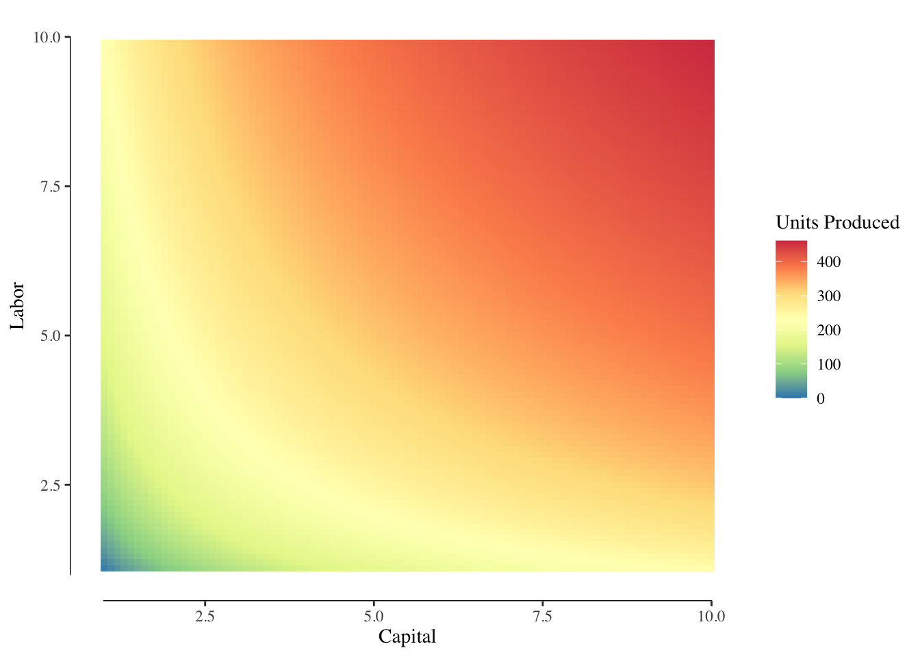
Figure 3.5: Example Production Function Output. Increasing labor and capital increases production. Red/warmer colors are greater output while blue/cooler colors are lower output.
As with utility, we are often interested in the marginal changes of production with increases in the amount of capital or labor in a firm. The marginal return of labor is the increase in production when \(L\) moves to \(L+1\) and there is no change in capital. The marginal return of capital is when \(K\) moves to \(K+1\) and there is no change in labor.
If we look the graph in Figure 3.5 and move along a constant value of capital or a constant value of labor, we may notice that the slope, or marginal return, is decreasing. This is very clear when plotting that line. Figures ?? and ?? show this relationship. We describe this as diminishing marginal returns to capital or labor.
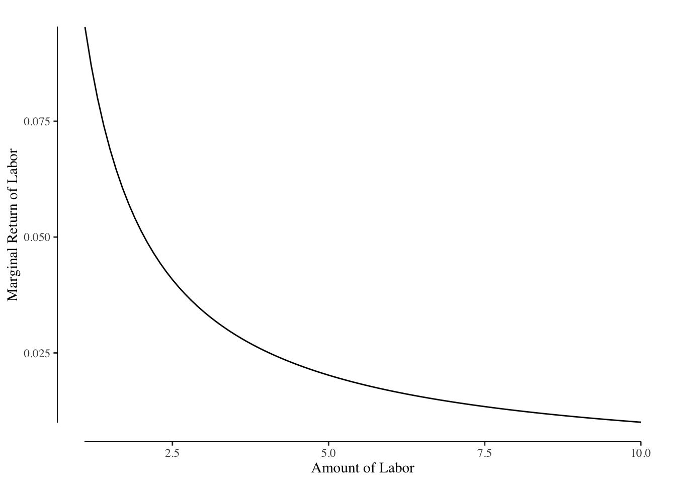
Why does the marginal return of capital and labor decrease? It can useful to think of an example of using capital, Roombas, to vacuum a room. Each Roomba you add to the room will decrease the amount of time it takes to vacuum the room but by smaller and smaller amounts. Eventually, since the Roombas are not guided, they will duplicate work or crash into each other reducing efficacy.
A less trivial example might be adding capital to your kitchen on Thanksgiving in the form of an extra oven. The additional capital will likely decrease the total time it takes to get food on the table, but it was not as important as the first oven. Likewise, a third oven may very slightly decrease the total time but the effect will be smaller than adding the second oven.
Adding more labor to the kitchen has the same problem. There are only so many jobs and only so many people can work on a given task at a time. For instance, if the only task is stirring a pot, having two people in the kitchen does not meaningfully decrease the time to make the meal. As you add more people to the kitchen, you start having the friction of “too many chefs” and the additional value of each person is smaller and smaller.
Our models will assume that the marginal return of capital or of labor is always \(\geq 0\). In real life, this is not the case (see the example of Thanksgiving dinner!) but in most cases where we aren’t pushing the extreme plausible values of capital or labor, this is a reasonable assumption.
3.2.2 Cost Functions
The production function gives us the total number of units of a good that a firm would produce given a particular combination of capital and labor. The two inputs, capital and labor, also directly lead to the cost. We describe the relationship between capital, labor, and cost for a firm using the cost function.
The cost function for a firm is generally written as
\[ \text{Total Cost} = rK + wL \]
where \(r\) is the rental rate and \(w\) is the wage rate. The rental rate is the literal cost of renting the capital when rented or the opportunity cost of the money used to purchase the capital or used to replace the capital after it wears out.12 The wage rate is more straightforward - it is simply the wages per unit time paid towards the staff.
For our example pizza restaurant, we may suppose that the rental rate of an oven is $1,800 per year13, or $0.21 per hour and the staff are paid $10 per hour. The total cost function would then be \(0.21 * \text{ovens} + 10 * \text{employees}\) per hour.
3.2.3 Marginal Cost of Production
In general, we ignore the rental rate and the cost of capital. We are interested in what happens at the margins, small changes made in the short run. Generally, we assume that the amount of capital used by a firm is fixed in the short run. This is reasonably true - investment in capital is often expensive and may require other changes. For instance, our pizza shop may want to add an additional oven but doing so would require running additional gas lines, finding space, and adjusting the workflow in the shop to accommodate the new oven. This likely can’t be done on a short timeline. Therefore, we assume, at least as a reasonable approximation, that the only part of the total cost function that can be changed by a firm is the amount of labor and we can ignore \(rK\) when considering marginal costs.
The marginal cost of production is the amount of labor required to produce one additional unit of a good. If we suppose a firm if currently making 10 units of a good with \(K = 4\) and \(L = 1\), and increasing to 11 units would require increasing labor to \(L = 1.5\), the marginal cost is \(0.5w\) (the cost to purchase 0.5 additional units of labor).
Looking back Figure @(ref:output-marginal-return-labor), we can reexpress this as the number of units of \(L\) required to make one more unit of \(y\). This is the marginal labor required to produce another unit of good. This relationship is shown in Figure 3.6. In this graph, the lines are shown as straight but they are generally curved.
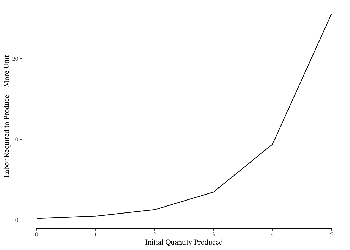
Figure 3.6: Labor required to produce one additional unit of the good.
The marginal return to labor is generally decreasing, as a result the marginal cost of production is generally increasing. As labor becomes less efficient (lower marginal return), the cost of using labor to make one more item increases (higher marginal labor).
The marginal cost is then given by \(w\Delta L\). In order words, we multiply the values in the y-axis (the additional amount of \(L\) required) and we have the marginal cost of increasing \(y\) by 1. If we assume that the marginal labor curve in Figure 3.6 is that for our hypothetical pizza shop and \(w = 10\), we get our marginal cost curve as shown in Figure 3.7.
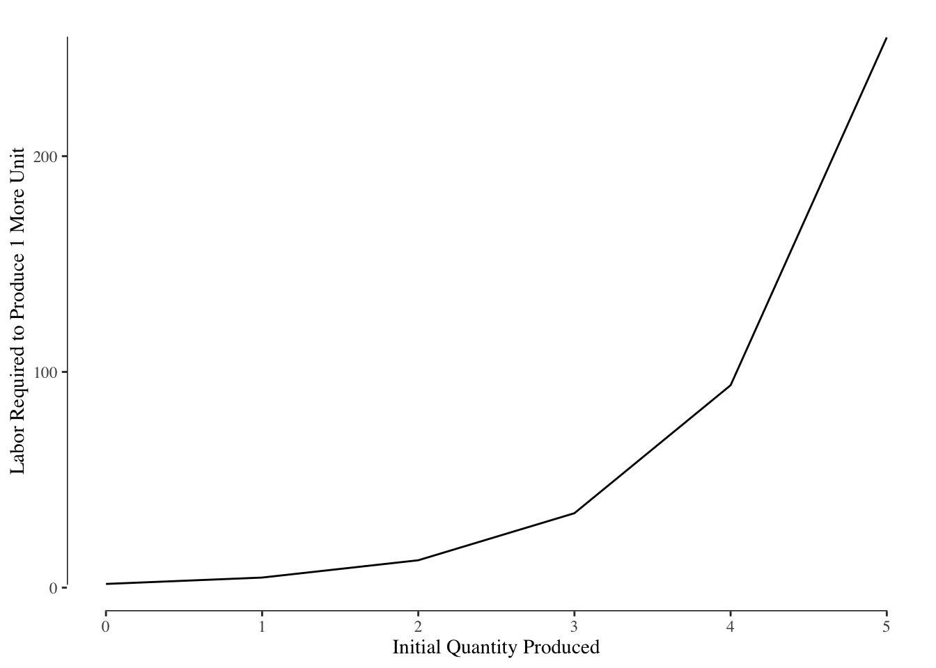
Figure 3.7: Marginal Cost of Production
3.2.4 Price and Quantity Supplied
Consumer’s determine what bundle to consume based on their preferences between two goods and their budget constraint. Firms engage in a similar process of constrained maximization. The cost of production acts as the constraint on the firm.
The firm’s object is to maximize profit. Profit for a unit is given by
\[ \text{Profit} = P - \text{MC} \]
where \(p\) is the price the good is sold for and \(MC\) is the marginal cost of production. Profit is positive whenever \(P \geq MC\) and negative when \(P < MC\). This leads directly to the firm’s equilibrium point. This leads directly to the conclusion that the firm would ideally want to produce goods until the price that it is sold for is equal to the marginal cost of production, or \(P = MC\).
Why?
If \(P > MC\), the firm would want to produce another unit of a good. They can sell the good for more than it costs to make, therefore increasing their profit.
If \(P = MC\), they do not make any profit on making another unit. While they can produce that unit, since there is no profit, we assume that is when they stop.
If \(P < MC\), the firm will not want to produce that unit. It will cost more to make than they can sell it for. This will cost the firm money, reducing their profit, and is something they certainly do not want to do.
Why does a firm not stop producing when profit is higher or increase the price to produce more? We assume that the firm is operating in a free market.14 A free market has some great properties: it ensures maximal profit for the firms, it ensures maximal utility for consumers, and maximal social surplus. A free market has four underlying assumptions:
- No barriers to entry or exit
- All firms and buyers are price takers and not price setters
- There are many firms
- There are many buyers.
or, in more detail,
Businesses can easily enter the market if they see an opportunity to make a profit and easily leave the market if the opportunity fails to materialize. There are no start-up or close-down costs or legal/regulatory barriers.
Firms are unable to set the price that they sell at. This is a result of item 3. Likewise, consumers (buyers) take the offered price and are unable to adjust the price. This is a result of item 4.
There are many firms in the market selling each type of good. If there are only a small number of firms (or even just 1), the small number of firms could coordinate with each other they to set the price (oligopoly) or, in the extreme case of just having one firm, become a monopoly. If there are many firms, if one firm set the price \(P > MC\), other firms would be tempted to enter the market selling at price lower than the current price but above or equal to the marginal price. Since there are no barriers to entry/exit, any time \(P > MC\), firms will enter the market and drive down the price.
There are many buyers in the market. We are more culturally aware of the idea of a monopoly but monopsony is the equivalent condition with only one buyer and oligopoly is a condition with a small number of buyers. If there was only one or a small number of buyers in a market, the buyer could dictate the price that they pay. A classic example of this would be a “company town” where there is a single buyer of labor. Since the employees could not move towards other employers, the company could dictate the wages paid to the employees.
When these four assumptions are met, firms will produce goods until \(P = MC\), therefore \(MC\) directly determines \(Q_s\) or the quantity supplied by a firm. In other words, the marginal cost curve is the supply curve for a firm.
3.2.5 Elasticity of Supply
As with demand, we measure the response to the quantity supplied with changes in the price using the elasticity, this time \(E_s\) or the elasticity of supply. As before, this is the
\[ E_s = \frac{\Delta \% Q_s}{\Delta \% P} \]
The formula, using the midpoint or arc method, for calculating the elasticity of supply is the same as the one used for calculated \(E_d\) except \(Q_d\) is replaced with \(Q_s\).
Supply can either be elastic or inelastic. Perfectly inelastic goods include collectible items (say paintings by famous authors or limited edition series) or things like land where no matter the price the supply is totally fixed. Inelastic goods are goods were \(Q_s\) changes little with changes in price while elastic goods have significant swings in \(Q_s\) with price.
In the short run, most goods have relatively inelastic supply. This is due to the lead time required to change production volumes. For instance, a farmer cannot decide, mid-season, to increase or decrease production of crops. That decision has to be made before the season starts. Other products have significant research and development costs, such as a new car. Additionally, raw materials used as inputs may have a time lag. Some goods, like made to order food, may be less inelastic than others, but most are relatively inelastic in the short run.
In the longer run, over several years, many goods become more elastic with respect to supply. You can imagine in response to several low price or high price years, a farmer may change the farm’s output based on this new pattern.
3.3 Competitive Equilibrium
The supply and demand curves each only tell part of the story. We can determine how many widgets a firm would be willing to supply given their production and cost functions, but that doesn’t tell us how many will sell at what price. Likewise, the demand curve tells us how many items consumers would be willing to buy, but not how many would be provided. It is only by considering both curves that we are able to identify the competitive equilibrium, or the point at which the market clears.
3.3.1 The Competitive Equilibrium Occurs Where Supply = Demand
Consider the market for pizza slices shown in Figure 3.8. The line shown in red is the supply line - the relationship between price and quantity for producers - and the line shown in blue is the demand line - the relationship between price and quantity for consumers.
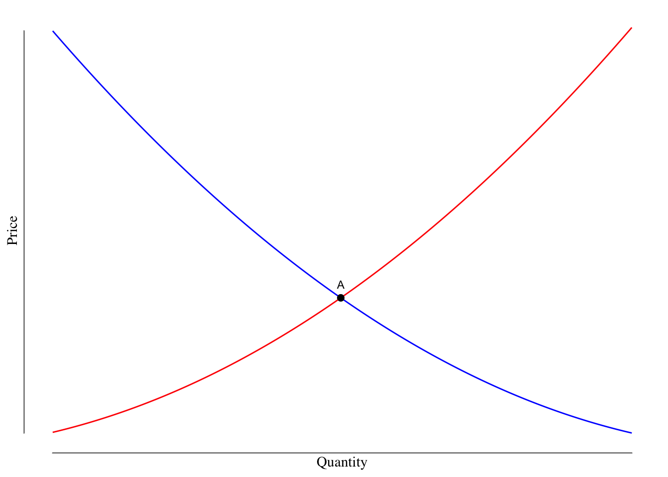
Figure 3.8: Supply and Demand Curves for Pizza. The red curve is the supply curve while the blue curve is the demand curve. The point highlighed and labeled as A is the competitivve equilibrium.
The point at which they intersect, labeled with a black dot and letter A in Figure 3.8, is the location of the competitive equilibrium and the point at which the market clears. From here we can in the quantity supplied and price, Figure 3.9.
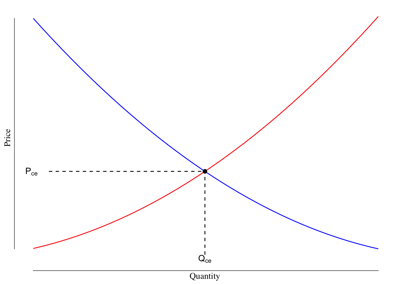
Figure 3.9: Supply and Demand Curves for Pizza. The dashed lines show how we arrive at the quantity and price at the competitive equilibirum.
The value \(Q_{\text{CE}}\) gives us the quantity that clears the market. This is the number of units that will be produced and purchased at the competitive equilibrium. The value \(P_{\text{CE}}\) gives us the price that will clear the market or the price at which those \(Q_{\text{CE}}\) goods will be purchased and sold at.
3.3.2 Why the Competitive Equilibirum Occurs at the S/D Intersection
Why does the competitive equilibrium occur where the supply and demand are equal? Let’s consider the two alternatives:
Demand is greater than supply (e.g., \(Q < Q_\text{CE}\)): In this case, producers would want to increase the amount of things they are making to take advantage of the excess supply. Suppose that for the quantity in question, consumers are willing to pay $30 and the marginal cost of production is $15. A firm would want to make that next unit because the profit associated with it is $15. If a given firm doesn’t make that unit, because we are assuming a free market, another firm will enter the market and meet the excess demand. As a result, if \(Q < Q_\text{CE}\), firms will increase their production until \(Q = Q_{\text{CE}}\).
Demand is less than supply (e.g., \(Q > Q_\text{CE}\)): If demand is under supply, it means consumers are unwilling to purchase the marginal item of a good made at that price. Suppose at \(Q\), the price consumers are willing to pay is $15 but the marginal cost of production is $20. By making that unit, the producer is unable to sell at or above the cost of production. Therefore, the producer will ramp down production until \(Q = Q_{\text{CE}}\).
However, at \(Q_\text{CE}\) each unit of a good that a firm supplies is purchased by consumers at a price that is equal to or greater than the marginal cost. This results in the highest possible profit for the producer and the greatest value for the consumer given their constraints.
3.4 Shifts in Supply and Demand
The location of the competitive equilibrium will shift in response to changes in the supply and demand lines.
3.4.1 Changes in Demand
The quantity demanded at a given price may change, resulting in a shift in the demand line. Recall that the demand line is a natural outgrowth of consumer preferences. Therefore, if consumer preferences change (shifting towards or away towards a given good), the demand for the good can change. This may result from changes in the price of a substitute good (imagine a case where the price of jelly goes down, the relative preference for PBJ sandwiches may increase or the release of a new game like Animal Crossing on the Nintendo Switch in Spring 2020) or shifts in actual consumer preferences (think of boycotts against various companies or when a company redesigns their product to make it better). We model these changes by shifting the demand curve to the right (to show a decrease in demand) or to the left (to show an increase in demand).
Increases in demand result in people being willing to pay greater prices for the same quantity of goods. Consider the example of release of Animal Crossing: New Horizons in March 2020. Between pre-existing desire for the game and the effects of the COVID19-induced lockdown, there was an increase in demand for Nintendo Switches. People were willing to pay greater amounts of money for a given quantity of Switches leading to the demand curve shifting to the right. This is shown in Figure 3.10.
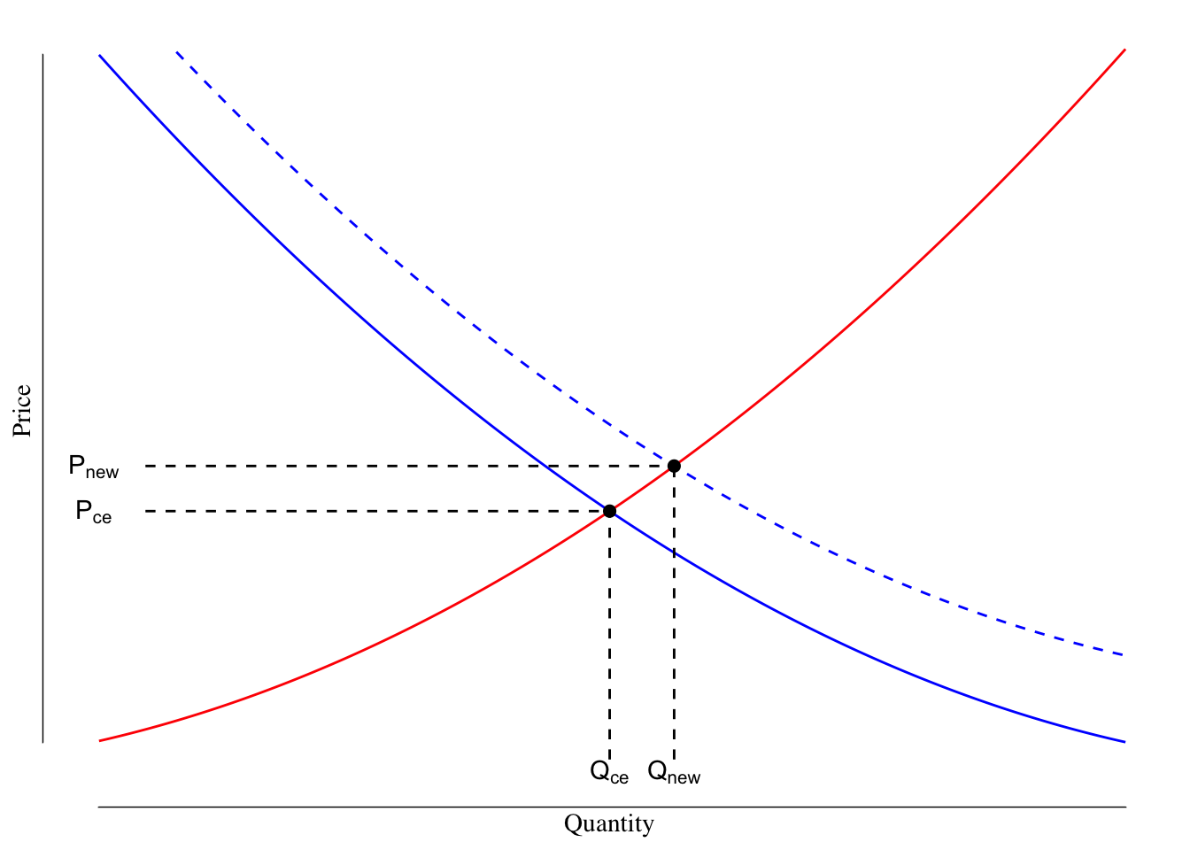
Figure 3.10: Supply and Demand Curves for Nintendo Switch. The supply line is shown in red. The orginal demand line is shown as a solid blue line while the demand after the market changes in shown as the dashed blue line.
In the competitive equilibrium before the release of the game, the Nintendo was selling \(Q_\text{CE}\) systems at price \(P_\text{CE}\). With the shift in the demand curve, Nintendo was capable of selling \(Q_\text{new}\) systems at price \(P_\text{new}\). Note that with the increase in demand, both \(Q_\text{new} > Q_\text{CE}\) and \(P_\text{new} > P_\text{CE}\). In other words, Nintendo would have been able to sell more systems at a greater price than prior to the pandemic-induced lockdowns and release of the game.15
The opposite can happen where demand for a good decreases. A decrease in demand occurs when consumers are willing to buy less of a good at a particular price. This causes a leftward shift in the demand curve. For instance, when a new model year or version of a product comes out, demand for the prior year decreases. When Apple announces the iPhone 12 in a few weeks, the demand for the prior version (iPhone 11) will decrease. Many people simply walk into a store and buy the current model of the phone they want. We can show this as in Figure 3.11.
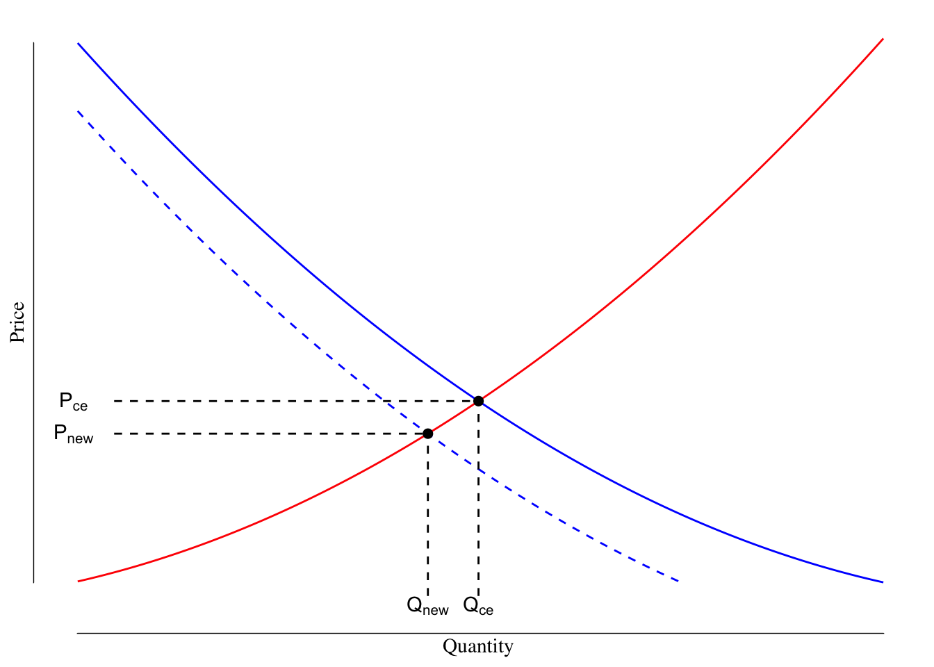
Figure 3.11: Supply and Demand Curves for iPhone 11. The supply line is shown in red. The orginal demand line is shown as a solid blue line while the demand after the market changes in shown as the dashed blue line.
After the leftward shift in the demand curve, the new equilibrium point occurs at a point where \(P_\text{new} < P_\text{CE}\) and \(Q_\text{new} < P_\text{CE}\). With the shift in the demand curve, consumers are willing to pay less for a good and buy less, even at the new lower price.
3.4.2 Changes in Supply
The supply curve can also shift with the supply either increasing or decreasing depending on the cause. The two most basic ways that a supply curve shifts is by either a subsidy or a tax altering the marginal cost.
Often governments use subsidies to increase production of goods that they want more of. For instance, in Iowa, the state will pay a small amount of money to property developers who build workforce housing on a per-unit basis. This may encourage developers to build more housing as the cost is slightly reduced compared to previously. Increases in supply (lower marginal costs) shift the supply curve to the right as the marginal cost for any given quantity is now lowered by the amount of subsidy. See Figure 3.12 for a graphical demonstration.
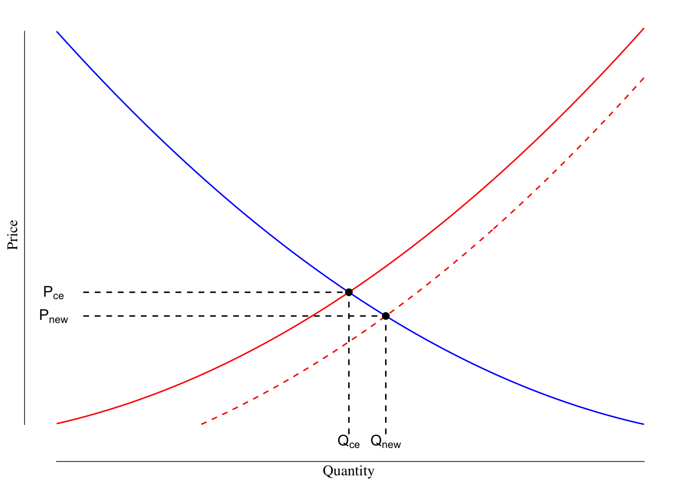
Figure 3.12: Supply and Demand Curves With Reduced Marginal Costs of Production. The orginal supply line is shown in red while the shifted supply line is shown as a dashed red line. The demand line is shown as a solid blue line.
Following the shift in the supply curve from the subsidy, we see that \(Q_\text{new} > Q_\text{CE}\) but \(P_\text{new} < P_\text{CE}\). The rightward shift in the supply curve increased the number of units produced and lowered the price at which the market clears.
A leftward shift in supply shows increased marginal costs. This could result from a simple tax on production increasing costs to the producer but could also be the result of supply chain increases or increased costs of inputs. This has the impact of shifting the supply curve to the left, see Figure 3.13.
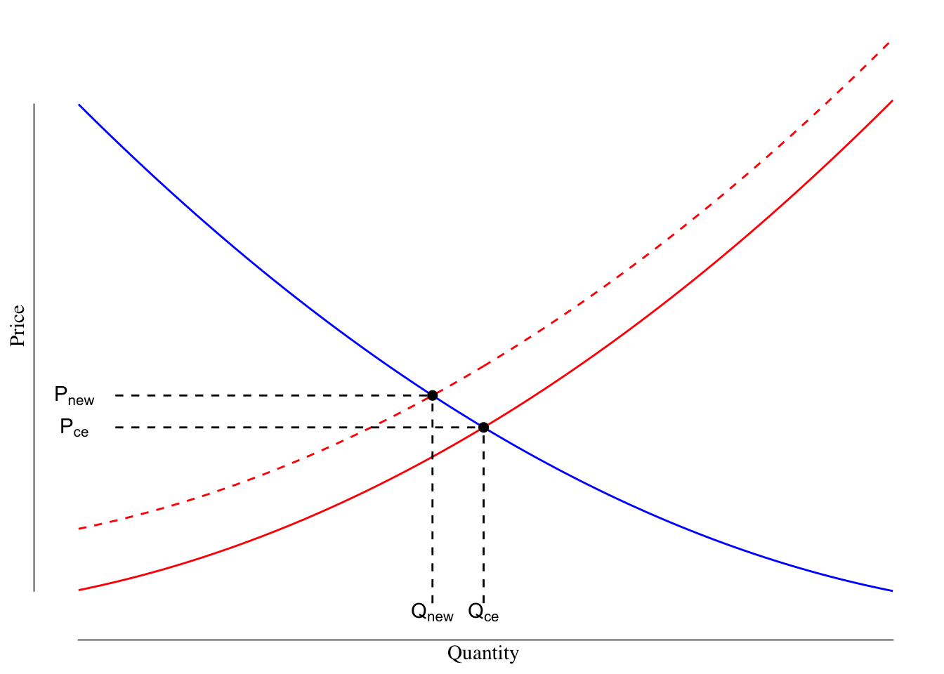
Figure 3.13: Supply and Demand Curves With Increased Marginal Costs of Production. The first supply line is shown in red while the shifted supply line is shown as a dashed red line. The demand line is shown as a solid blue line.
With the increase in marginal cost, the quantity produced decreases to \(Q_\text{new}\) and the price increases in \(P_\text{new}\). The increased marginal cost leads to \(Q_\text{new} < Q_\text{CE}\) and \(P_\text{new} > P_\text{CE}\).
3.4.3 Summary of Effects of Shifts in Supply and Demand
| Label | Shift | Effect on Price | Effect on Quantity | Examples |
|---|---|---|---|---|
| Increase in Demand | D to the Right | Increase | Increase | Preferences shift towards, increased consumer incomes/number |
| Decrease in Demand | D to the Left | Decrease | Decrease | Preferences shift away, fewer consumers/lower incomes |
| Increase in Supply | S to the Right | Decrease | Increase | Increased efficiency, lowered costs, subsidies |
| Decrease in Supply | S to the Left | Increase | Decrease | Lower efficiency, excise taxes, increased input costs |
3.4.4 Short-Run Versus Long-Run Shifts
The I-405 in Los Angeles runs between the 10 and 101 freeways and is one of the busiest highways in the United States. In May 2014, this 10 mile stretch of highway was expanded with an additional lane in each direction at the cost of $1.6 billion. In May 2015, traffic moved at an average of 23 mph and it took 23 minutes to travel the segment. However, in 2019, the speed decreased to 19 mph and travel time increased to 34 minutes.16
The Katy Freeway in Texas (I-10) runs from downtown Houston to the suburbs about 30 miles to the west. It is one of the widest interstates in the world at 23 lanes. These extra lanes came at the cost of $2.8 billion. Between 2011 and 2014, the morning travel times grew from 47 to 62 minutes while afternoon travel times increased from 42 to 64 minutes.17
Similar stories are found everywhere - a road is widened, travel times briefly decrease before returning to the previous travel times, if not even longer. Why?
Let’s consider the supply and demand graph. The price here is basically a measure of time and quantity is the number of cars that can travel through a section of roadway. If we widen a road, we are shifting the supply curve to the right: the roadway can now move a greater number of cars in a lower amount of time. The graphic of this situation is shown in Figure 3.14.
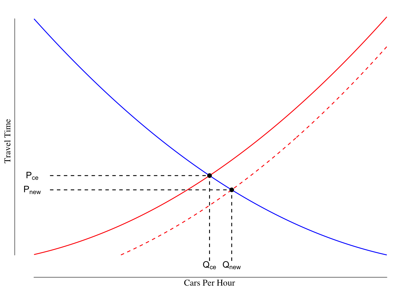
Figure 3.14: Shift in Supply Curve After Road Widening.
We have the result we hoped for - the travel time is lower \(P_\text{new} < P_\text{ce}\) and a few more cars are now traveling along the route ($Q_ > Q_) compared to before, but nothing the expansion cannot handle.
However, remember, before the shift people were willing to pay \(P_\text{CE}\) on their travel time. For instance, suppose that people are willing to drive 30 minutes for their commute and you widen the road reducing to that 30 minute drive to only 20 minutes. This has the effect of unlocking previously unattractive land for development. Before the widening, people were willing to live only inside the area that was within 30 minutes of their office. With a wider road, and faster travel, people can now living further way (in distance) but the same travel time. The land that was previously more than 30 minutes away but is now less than 30 minutes away gets developed - people build houses, apartment complexes, subdivisions. We could draw a supply and demand graph for housing where the price is related to the travel time to work. The road widening would have the effect of shifting supply to the right as more houses can now be built per minute of travel time.
The increase in supply of housing increases the number of residents compared to before the widening. This increase in residents means that the demand for the road has increased - shifting the demand curve to the right, see Figure 3.15. The dashed blue line reflects the shift in the demand curve following the opening of this new land for housing.
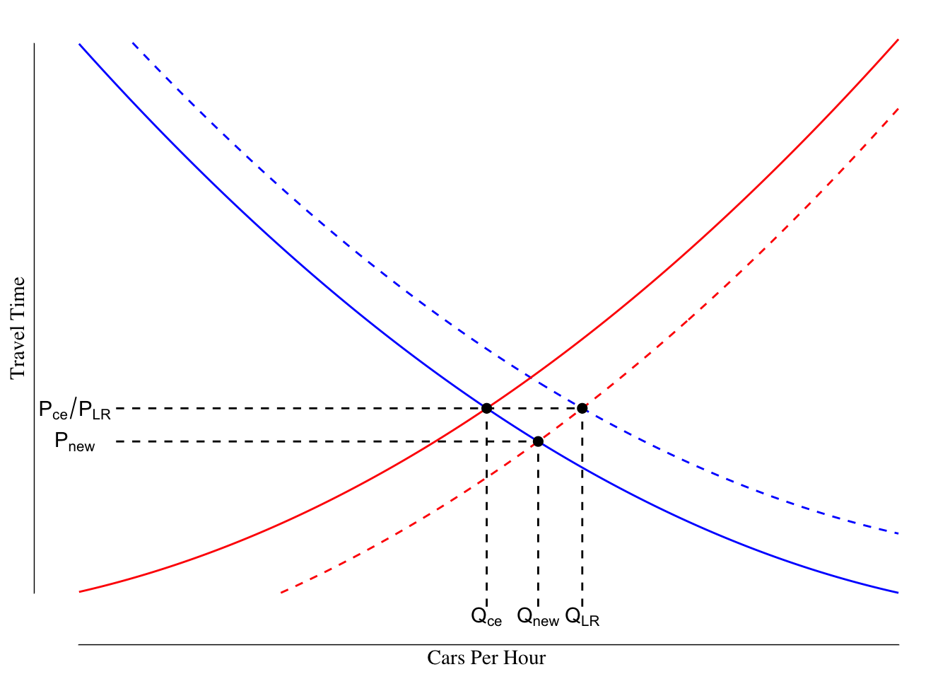
Figure 3.15: Shift in Demand Curve After Supply Shift Following Road Widening. The solid lines are the supply (red) and demand (blue) curves before the road widening while the dashed lines are the supply and demand curves after the road widening and the market settles.
Since people were willing to tolerate a drive of up to \(P_\text{CE}\) duration, in the long run, the demand curve will shift right until the price at equilibrium is \(P_\text{CE}\). This price increase occurs due to an increase in traffic volume above \(Q_\text{new}\) to some quantity \(Q_\text{LR}\) (LR for long run). In the long run, the travel time is not changed by the road expansion; however, the number of cars that can travel the segment is increased.
This phenomena is known as induced demand. By increasing supply, we “create” or “induce” a shift in the demand curve but opening new opportunities. There are often fears related to induced demand when considering certain public health measures, especially harm reduction. One commonly cited concern about providing supervised injection sites for people who have an addiction to drugs is that by making drug use safer (e.g., shifting the supply curve to the right by lowering the marginal cost or risk of drug injection) more people will start using drugs.
This concern appears, on it’s face, valid. If we make drugs safer to use, it is likely that some number of people who would have previously not elected to use drugs because of the injection risk might elected to use drugs now, shifting the demand curve to adjust for the new supply.
However, ultimately people likely elect to use or not use drugs because of other factors, not the safety of injection. Drugs have significant downside risks in terms of health, family, and employment and a high risk of addiction. People likely consider those risks, which dwarf the risks of injection site infections, more than the presence of a supervised injection center. Additionally, many drugs can be used in different routes: heroin, for example, is often injected, snorted, smoked, and, rarely, absorbed through the mouth. A safe injection site may encourage users to shift to injection from smoking but is unlikely to encourage non-users to become users.
Unless otherwise noted, we will be mostly concerned with the short-run changes in the quantity and price that clear the market; however, at times (especially when discussing cost-benefit analysis later in the semester), we will want to consider the market as part of a web of interconnected markets.
The number of movies consumed does not change in this example because of the structure of the utility function (\(U(m, p) = p_m \log(m) + p_p \log(p)\)). This is not true as a general rule.↩︎
Why might you ask is price on the y-axis when normally we think of the y-axis as the dependent variable and discuss this in terms of the number of things demanded at a given price? It would make more sense for quality to be on the y-axis and price to be on the x. According to this StackOverflow post, the answer more-or-less boils down to one of the earliest and most influential books about supply and demand models by Alfred Marshall in 1890 drew the graphs with price on the y-axis. He started doing this in 1879 and considered price to be the dependent variable and quantity to be the independent (at which price do I sell X items). All this means is this graph is probably flipped from the way we will often think about it and we are bound to draw it backwards, start filling it in, realize our mistake, and start over at least once this term.↩︎
This is not true of all goods. There is a class of goods known as Veblen goods, where the quantity demanded increases with the price of the good. Thorstein Veblen, a prominent American sociologist and economist, studied displays of social standing and wealth through consumption. He described this as conspicuous consumption, most famously in his book The Theory of the Leisure Class. An example of a Veblen good may be the early iPhone app called “I am Rich.” This app cost $1,000 and simply displayed a red jewel on the phone screen. The only value from the app came from the ability to display wealth through ownership. A total of six people bought the app. It is unclear that these purchasers would have bought the app had it been cheaper. More commonly, we might see this with luxury cars, watches, or designer items. The cost of these items is already sufficiently high to discourage “normal” consumption and much of the value comes from the display of wealth associated with ownership.↩︎
Some of this is drive by true consumer choices in favor of larger SUVs and pickups, as well as cultural trends. However, a large part is driven by the fact that it generally costs very little more to make an SUV or a pickup compared to a sedan but the SUV or pickup sells for a lot more money. This greater profit margin on SUVs and pickups encourages auto makers to encourage consumption of these types of cars over classic designs like sedans or hatchbacks.↩︎
We already were using \(C\) for costs. So \(K\), likely from the German kapital, is used to denote capital.↩︎
Note that even outright ownership of capital has a cost. Suppose I own a car and have paid off the loan. I could sell the car for its value and use the funds for other uses. This is why we consider the opportunity cost as part of the rental rate. Likewise, once a piece of capital wears out, it often must be replaced and so we would like to incorporate that into our model.↩︎
This assumes a 2% rate of inflation, a $15,000 oven, and replacement every 10 years, on average. The rental rate per year is then \(\text{rental rate} = \text{replacement cost} (\text{inflation rate} + \text{depreciation rate})\) or \(15000 (0.02 + 0.1) = 1800\).↩︎
The term “free market” has some political connotations that may or may not be describing a free market. Almost no market actually perfectly meets the assumptions that follow, but it holds as a first approximation.↩︎
You may notice that the secondary market of used systems had an increase in the number of people willing to sell a system they owned and an increase in price. The below figure shows the Amazon price history for new Nintendo Switches sold by Amazon (green line at $299.99) and other third party vendors (blue line).
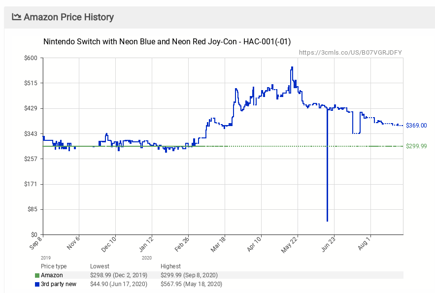
Before the pandemic, the price for a Switch from Amazon or a third party vendor using Amazon was about the same around the MSRP of $300. However, once the pandemic started and supplies became increasingly limited, the third party price increased massively. Companies that did not increase the price (like Amazon) would sell out almost immediately upon restocking.
Why did these companies (or Nintendo) not take advantage of the situation? Nintendo was unable to make enough units to sell at the new levels of demand, so they were unable to shift to \(Q_\text{new}\). Nintendo and large retailers did not increase their prices above the old MSRP because this would have likely resulted in backlash from consumers. Often times in a shortage like this larger firms will forgo potential profit possible by increasing the price to \(P_\text{new}\).↩︎https://usa.streetsblog.org/2019/05/08/l-a-really-is-a-great-big-freeway-thanks-to-induced-demand/↩︎
https://cityobservatory.org/reducing-congestion-katy-didnt/↩︎