Chapter 5 Externalities
Externalities are a very common type of market failure that arise when some portion of the cost or benefit of an action is not internalized to the people engaging in the trade. In plain language, we might say that externalities are “spill over” effects of some action. The spill over effects are “external” to the parties that make the trade, hence the term “externalities.” Fundamentally, an externality occurs whenever a benefit or cost of an action (either consumption or production) occurs to someone other than the parties to the action.
Many actions create externalities. Those of us living in apartments might be very familiar with the externalities created by an upstairs neighbor who just bought a set of home workout videos or an apartment nearby that hosts a loud party. Firms also create externalities through pollution. Externalities that we worry about are often negative; however, many externalities are positive. For instance, through herd immunity, getting a flu shot creates benefit for those who did not get the shot.
Externalities are especially relevant to public health. We are often worried the effects of large problems like climate change, air/water/ground pollution, transportation, fracking, sugary beverages, smoking, drug abuse, and so on. The framework of supply and demand allows us to describe why these effects arise and, ultimately, ideas for addressing the problems.
Broadly speaking, we divide externalities into four groups based on whether they occur with the production or consumption of a good and whether the effect of the externality is negative or positive.
5.1 Production Externalities
Production externalities are externalities that occur as a result of the production of a good. These result in us having changes in our supply curve to reflect the fact that some of the marginal cost is not paid by the producer of the good.
5.1.1 Negative Production Externality
Negative production externalities result from the production of the good having some negative effect on at least one person who is neither the buyer or producer of the good. The classic example here is of a factory emitting pollution into a river harming the local ecosystem and, as a result, farmers and fisherman who depend on that river’s clean water.
To make this a little more concrete, suppose we have a steel factory. In order to make steel, the factory must burn metallurgical coal - there is no non-coal alternative. The manufacture of steel therefore requires burning coal, which unavoidably emits soot and air pollution. People who live downwind of the factory will have greater rates of exacerbation of COPD, asthma, and other chronic lung conditions. For simplicity, let’s suppose each unit of steel requiring burning enough coal to make one unit of air pollution. Each unit of air pollution causes an extra $100 in health care costs for people living near the factory.
We’ll draw our supply and demand graphs here but we’ll make a small, but important, change. Before, we said the supply curve was the marginal cost of production (MC) of steel. Here, we are now to make clear that the supply curve reflects the private marginal cost (PMC) of production - the cost paid by the producer to make one more unit of steel. This is different from the societal marginal cost (SMC) - the cost to all of society to make one more unit of steel. The SMC is related to the PMC by the equation:
\[ \text{SMC} = \text{PMC} + \text{Marginal Damage} \]
In other words, the cost to society is the sum of the cost to make one more unit of steel in terms of inputs and labor plus the marginal damage (the harm) to others in society. Since the company does not pay for this harm, the PMC and SMC are not equal.
As a result, when we draw our supply and demand graph we include two supply curves: one based on the PMC (the traditional supply curve) and one based on the SMC. Figure 5.1 shows the market with the PMC (red solid line) and the SMC (red dashed line). The black solid lines measure the quantity and price when the PMC is used as the supply lines and the black dashed lines show the quantity and price using the SMC.
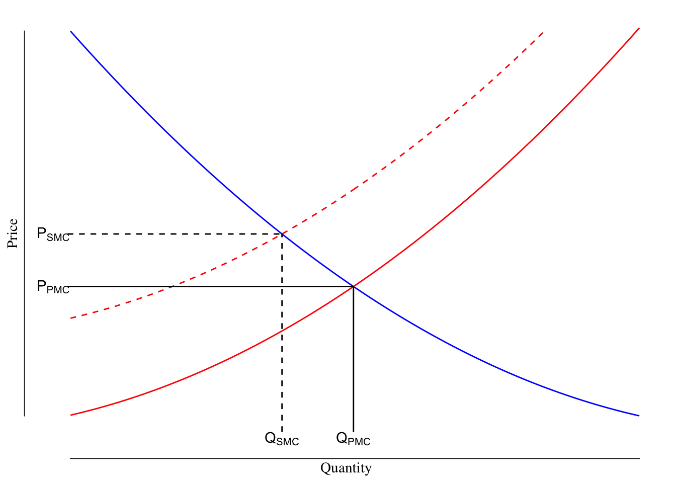
Figure 5.1: Demand, Private and Societial Marginal Cost Curves in a Market with a Negative Production Externality. The blue line is the demand curve while the red lines denote the PMC (solid) and SMC (dashed) curves. The black lines measure the quantity and price using the PMC (solid) and SMC (dashed) marginal cost curves. Using the PMC as the supply curve results in a lower price and an increased amount of prodution compared to what is socially optimal.
Society would prefer that the SMC is used as the supply curve as it reflects the actual marginal cost whereas the PMC omits the harm caused by the air pollution. The factory owners would prefer to use the PMC as that reflects their actual cost and using the SMC would leave profit “on the table.” Since the transactions are occurring only between people buying the steel and the factory (in other words, the people with asthma near the factory are not parties to the transaction), the free market would use the PMC curve as the supply curve.
From the prospective of society, this results in too low of a price and too much steel being made. The society would prefer \(Q_\text{SMC}\) steel get made while the free market would prefer \(Q_\text{PMC}\), which means that \(Q_\text{PMC} - Q_\text{SMC}\) too many units of steel get produced. We can use this and the two curves to determine the extent of the harm created by the externality.
Let’s suppose that \(Q_\text{SMC}\) is 10 and \(Q_\text{PMC}\) is 15. We might have data that looks like this:
| Units of Steel | SMC | PMC | Price Demanded |
|---|---|---|---|
| 10 | 15 | 5 | 15 |
| 11 | 16 | 6 | 14 |
| 12 | 17 | 7 | 13 |
| 13 | 18 | 8 | 12 |
| 14 | 19 | 9 | 11 |
| 15 | 20 | 10 | 10 |
At the 10th unit of steel, the SMC is equal to the demand. The value gained by buyer from that trade (the price demanded) is equal to the SMC and so there is no harm. However, for the 11th piece of steel, the value gained by the buyer is $14 but the SMC is $16. This means that $2 of harm was created to society by the production of the 11th piece of steel. The pattern continues for the 12th piece ($13 in value to buyer, $17 harm to society) and so on until the 15th piece where the value to the buyer ($10) equals the PMC ($10) and creates $20 of harm.
Graphically, this is the difference between the SMC and the demand curve for the region between \(Q_\text{SMC}\) and \(Q_\text{PMC}\), Figure 5.2. This region is the deadweight loss of the externality or the harm that results from the free market having trades that cause a net harm to society.
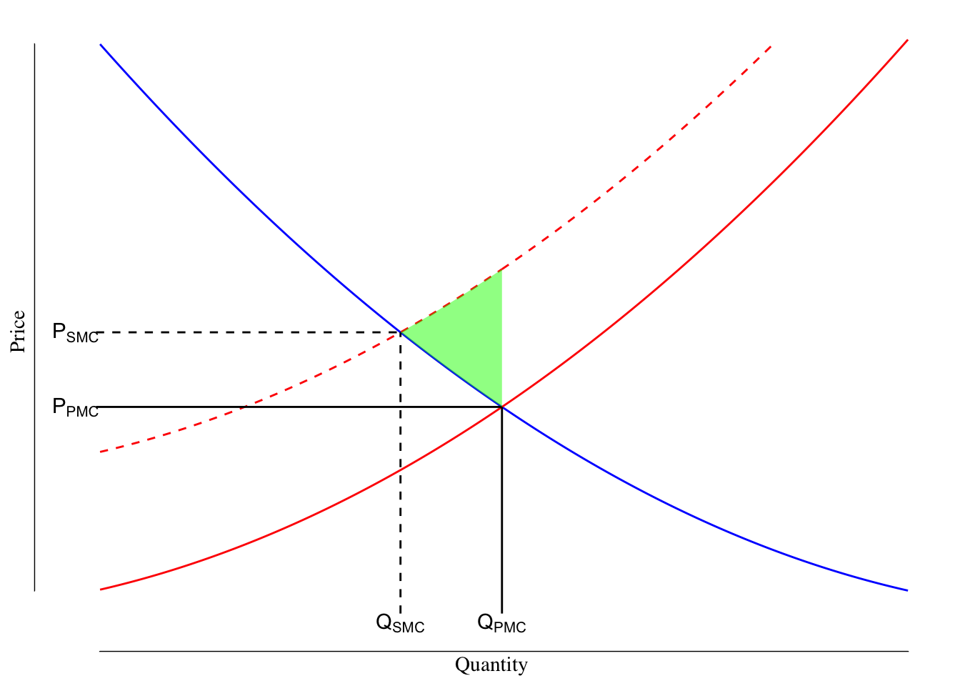
Figure 5.2: Demand, Private and Societial Marginal Cost Curves in a Market with a Negative Production Externality. The blue line is the demand curve while the red lines denote the PMC (solid) and SMC (dashed) curves. The black lines measure the quantity and price using the PMC (solid) and SMC (dashed) marginal cost curves. The deadweight loss is shaded in green.
5.1.2 Positive Production Externality
Production externalities can also be positive. For instance, if someone keeps a beehive to make honey, others near that beehive will experience benefits from the bees pollinating their plants.22 Similarly, planting a tree provides value in terms of beauty and health effects for people living near you. Yet in both of these cases, those who are getting value do not pay for that value. The local gardener does not pay the beekeeper for the work done by her bees and I do not pay my neighbor for the value I get from his trees.
This creates a situation where the SMC includes a benefit that is not included in the PMC. As a result, in the case of a positive production externality,
\[ \text{SMC} = {PMC} - \text{Marginal Benefit} \]
or the SMC is the PMC reduced by whatever the marginal benefit is.
For instance, suppose the beekeeper was considering expanding her hive. The expansion would cost $250 and the bees in that portion of the hive would provide $25 worth of pollination. The PMC is $250 while the SMC is \(\$250 - \$25\) or $225. While the negative production externality resulted in the SMC being greater than the PMC, the positive production externality results in the SMC being lower than the PMC.
An example market is shown in Figure 5.3. The deadweight loss is the region between \(Q_\text{PMC}\) and \(Q_\text{SMC}\), above the SMC curve, and below the demand curve. This reflects the value that society would have gotten had the SMC curve been used as the supply curve.
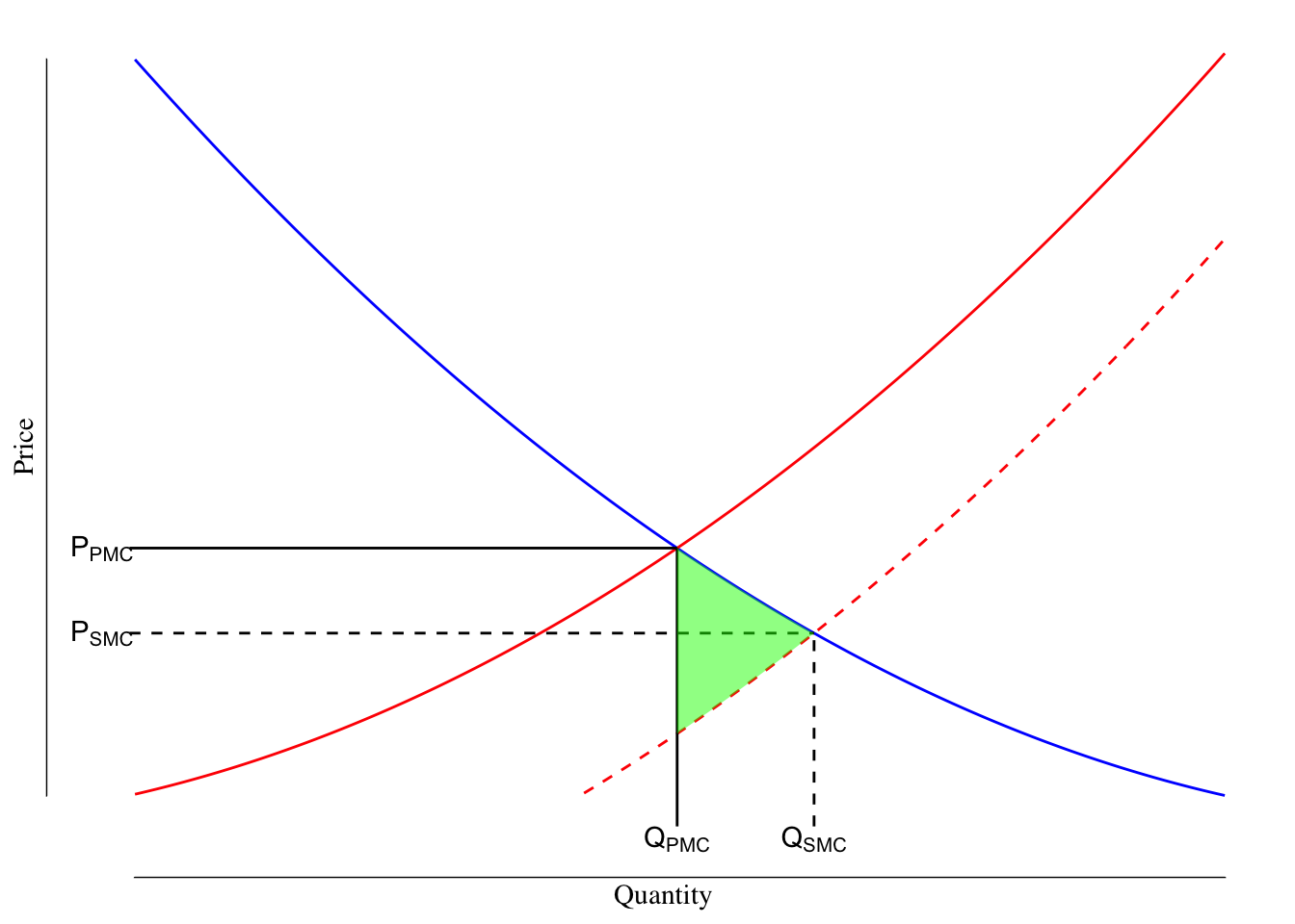
Figure 5.3: Demand, Private and Societial Marginal Cost Curves in a Market with a Positive Production Externality. The blue line is the demand curve while the red lines denote the PMC (solid) and SMC (dashed) curves. The black lines measure the quantity and price using the PMC (solid) and SMC (dashed) marginal cost curves. The deadweight loss is shaded in green.
In the free market, there will tend to be an under supply of goods that have a positive production externality and they will be supplied at a price higher than what society would prefer.
5.2 Consumption Externalities
Our examples so far have focused on production externalities. However, many externalities result from consumption. Some people elect to buy a large SUV or truck for safety reasons. If you are in a large SUV, all else equal, you are likely safer in the event of a crash than if you are in a small car. Yet, that extra safety comes at a cost: a driver of a car is 4 times more likely to be killed when in a crash with an SUV than another car, they cause 3-4 times more “damage” to the roadway due to their heavier weight than a typical car, are much more likely to seriously injury or kill pedestrians, and contribute to greater levels of emissions per mile traveled. The driver of the SUV gets a benefit (they are safer) but impose a harm on others (they are less safe) that results from consumption (that is driving the SUV) and not production.
5.2.1 Negative Consumption Externality
The example with the SUV is an example of a negative consumption externality. While the production externalities shifted the supply curve by impacting the marginal cost of production, consumption externalities split the demand line.
We break the demand into the private marginal benefit (PMB) and the societal marginal benefit (SMB). Similar the relationship between the SMC and PMC in a negative production externality
\[ \text{SMB} = \text{PMB} - \text{Marginal Damage} \]
In our example with the SUV, the PMB is the safety improvement to the driver and people inside the SUV while the marginal damage in the increased risk to everyone outside of the SUV.
We can describe this with the market shown in Figure 5.4. The blue dashed line is the SMB while the blue solid line is the PMB. The difference between these curves is the marginal harm associated with consumption.
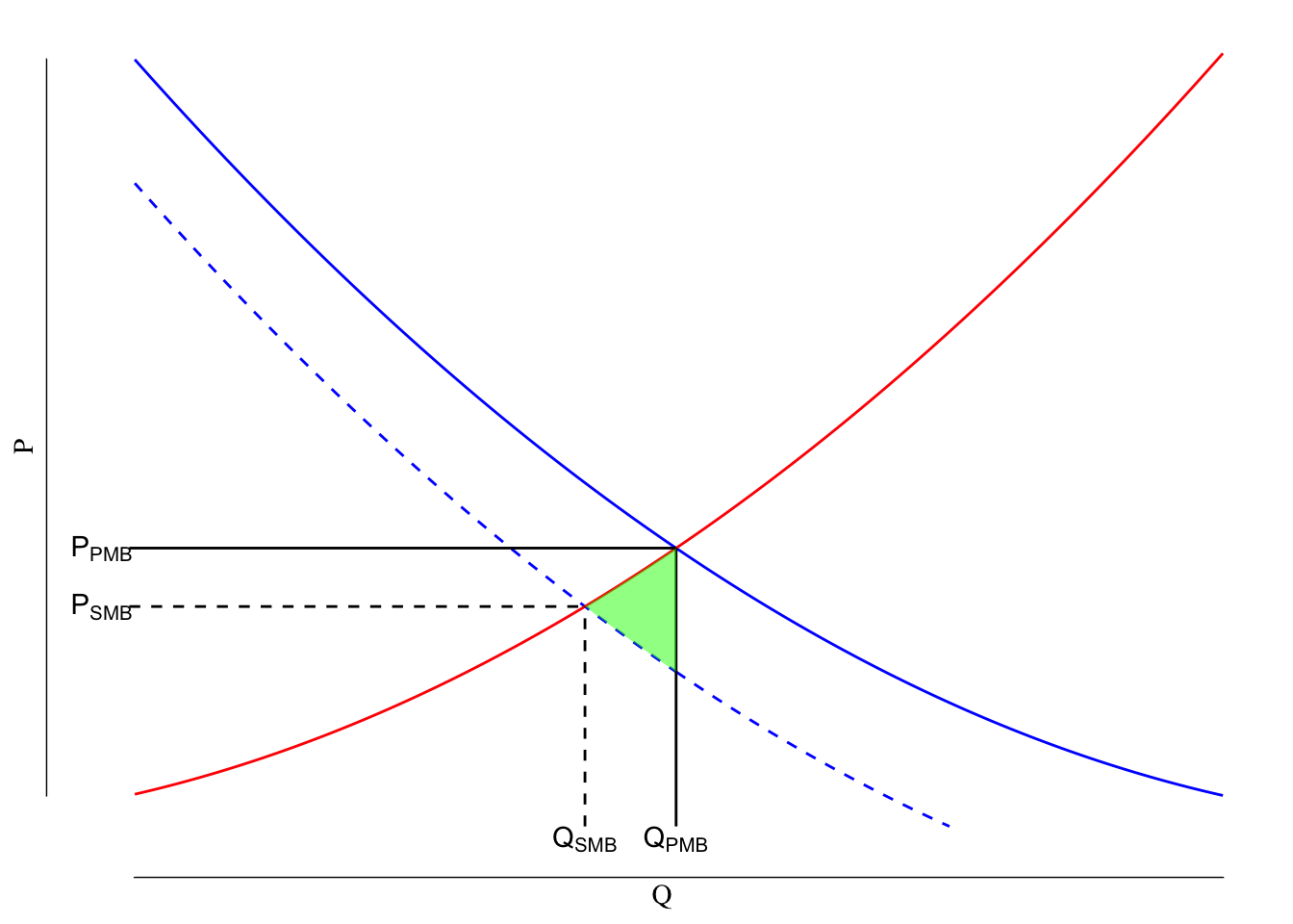
Figure 5.4: Example of a Negative Consumption Externality. The solid red line is the supply curve, the blue lines reflect demand with the solid blue line being the private marginal benefit (PMB) and the dashed blue line being the societial marginal benefit (SMB). The shaded green area is the deadweight loss associated with the negative consumption externality.
Relative to what society optimally wants, goods with a negative consumption externality will be over-consumed and will be offered at a price lower than what is optimal. This creates a harm to society. We measure the scale of the harm associated with the externality using the deadweight loss. The deadweight loss is the region between \(Q_\text{PMB}\) and \(Q_\text{SMB}\), above the SMB curve and below the supply curve. It is shaded in green in Figure 5.4.
5.2.2 Positive Consumption Externality
As before, it is possible for consumption of a good to create spillover positive benefits to others. For instance, we are asked to wear a mask in public during the COVID-19 pandemic. While a cloth or surgical mask may offer limited protection against getting infected, they offer massive protections to others from people who are infectious spreading the infection. The benefit of mask wearing is almost entirely realized by others. The act of consumption (wearing a mask) creates a marginal benefit to others.
We formalize this as:
\[ \text{SMB} = \text{PMB} + \text{Marginal Benefit} \]
and shift the PMB upward by the value of the marginal benefit. We can show a market with a positive consumption externality as in Figure 5.5.
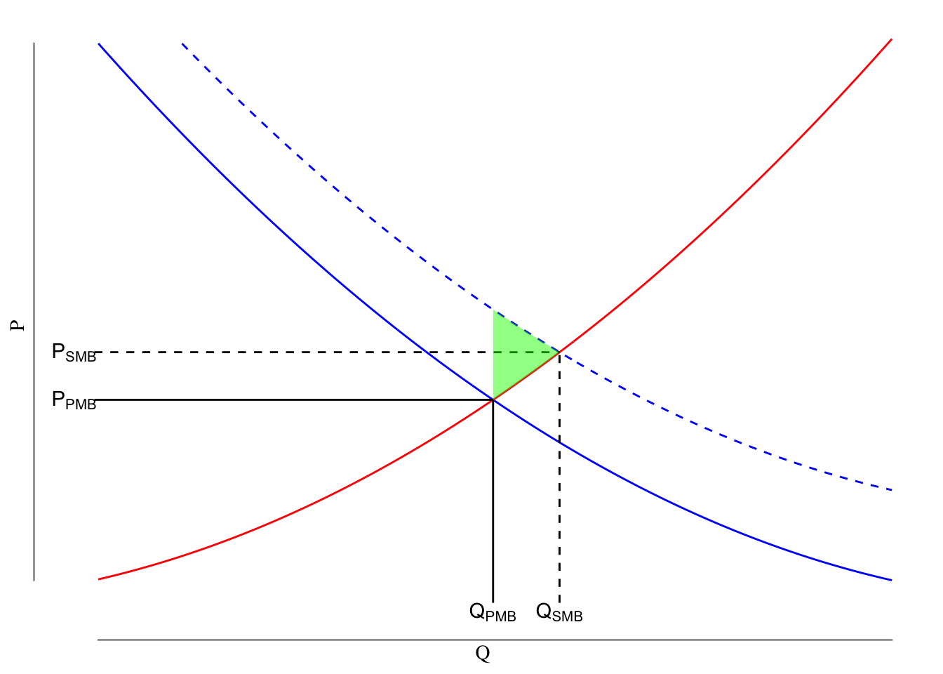
Figure 5.5: Example of a Positive Consumption Externality. The solid red line is the supply curve, the blue lines reflect demand with the solid blue line being the private marginal benefit (PMB) and the dashed blue line being the societial marginal benefit (SMB). The shaded green area is the deadweight loss associated with the positive consumption externality.
The free market will tend to underproduce goods with positive consumption externalities and will produce them at a price higher than preferred. This creates a deadweight loss bounded by \(Q_\text{PMB}\), \(Q_\text{SMB}\), above the supply line, and below the SMB line. This region is shaded green in Figure 5.5.
Send me a link to your favorite YouTube video for 1 point of extra credit on problem set number 1 (nominally worth 10 points). This offer expires Wednesday 9/23/2020.
5.3 Externality Summary Table
| Cause | Example | Supply | Demand | DWL Location | Quantity Compared to Socially Optimal | ||
|---|---|---|---|---|---|---|---|
| Negative Production | Harm caused by the manufacture of a good | Air/ground/water pollution | PMC < SMC | PMB = SMB | \(Q_\text{SMC}\) to \(Q_\text{PMC}\), below SMC, above demand | Too high | |
| Positive Production | Benefit created by producing a good | Planting trees, pollination by bees | PMC > SMC | PMB = SMB | \(Q_\text{SMC}\) to \(Q_\text{PMC}\), above SMC, below demand | Too low | |
| Negative Consumption | Harm created by use of a good | Large SUVs, second-hand smoke | PMC = SMC | PMB > SMB | \(Q_\text{SMC}\) to \(Q_\text{PMC}\), below supply, above SMB | Too high | |
| Positive Consumption | Benefit created by the use of a good | Getting vaccinated, wearing a mask | PMC = SMC | PMB < SMB | \(Q_\text{SMC}\) to \(Q_\text{PMC}\), above supply, below SMB | Too low |
5.4 Public Health Relevant Externalities
We will discuss 6 public health relevant externalities
- Climate change
- Smoking and vaping
- Legal drinking age
- Antibiotic resistance
- Free parking in cities
- COVID-19
in class on Tuesday. For each, we’ll discuss
- Is there an externality?
- Is is a negative or positive externality?
- Is it a production or consumption externality?
- Why is this externality (or set of externalities) public health relevant?
This is actually a critical service “provided” by bees. There is currently a shortage of bees due to colony collapse disorder resulting in large-scale and wide-spread death of bees. As a result, there are commercial services where you can “rent” a bee colony to pollinate your field. Essentially, a semi-truck pulls a trailer full of bees around and doors are opened to allow them to do their bees-nes. (Sorry, not sorry.) Every few years, one of these trucks crashes. In June 2019, one crashed in Montana carrying 40,000 pounds of bees. When the fire department arrived on the scene, they estimated approximately 10,000 pounds of bees had escaped. A bee weighs about 0.00025 pounds and so a pound of bees would require about 4,000 bees. Given that 10,000 pounds of bees escaped, that would suggest there were about 40,000,000 (!!!) bees flying around when they arrived. Fortunately, Nicolas Cage was not at the scene.↩︎